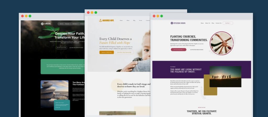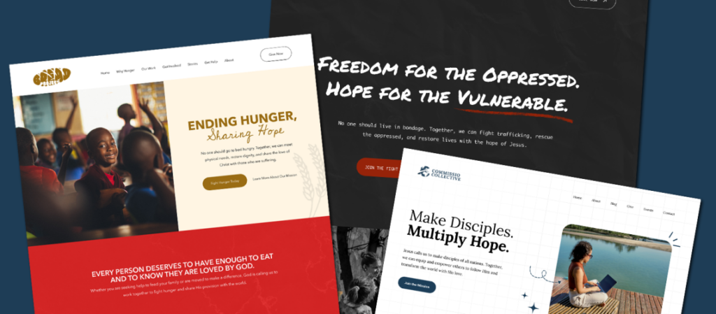
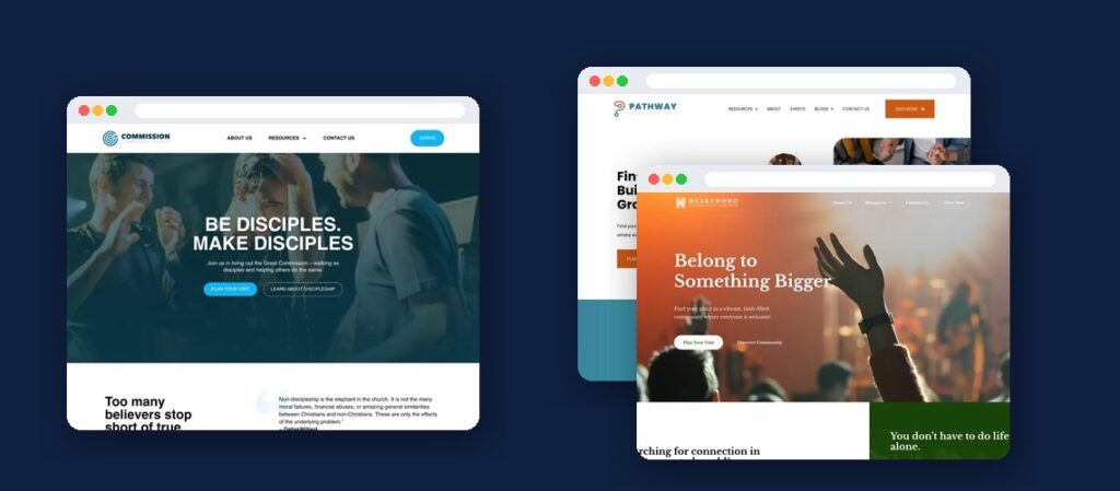
You probably know the feeling. You visit another church’s website, look around for a minute, and think, Why doesn’t ours look like this?
Maybe their photography feels more personal. Maybe the homepage is easier to understand. Or maybe the whole experience feels welcoming before you’ve read a single paragraph. A cool church website helps people feel comfortable taking their first step toward your church and helps them see themselves in the story you’re inviting them into, with or without flashy animations or an expensive design.
If you’re gathering inspiration for your own church website, here’s what to look for, what makes certain designs work, and which ideas are worth bringing home.
Table of Contents
What Makes a Cool Church Website Feel Modern
Modern church website design has less to do with following trends and more to do with removing obstacles.
The best designs make information easy to find, give people room to explore, and help visitors picture themselves walking through your doors.
A few design decisions make a noticeable difference.
Plenty of White Space
Generous white space makes a website easier to read. It also gives important information room to stand out.
You don’t need to fill every available space with announcements, scripture quotations, ministry descriptions, and calls to action.
A homepage with fewer competing elements often feels more intentional.
Photography That Feels Like Your Church
Visitors want to know what your community looks like.
Photos of real people worshiping, connecting, serving, and spending time together tell them more than generic stock images.
Your photography doesn’t need to look like a professional advertising campaign. It should feel honest, warm, and recognizable to the people who attend.
One Obvious Next Step
Someone visiting your church’s website for the first time should quickly find a way to plan their visit.
That might be a Plan Your Visit button, a New Here? link, or a short section with service times and directions.
The wording matters less than making the next step obvious.
A Comfortable Mobile Experience
Many visitors will encounter your website on a phone.
They shouldn’t have to pinch and zoom, hunt through complicated menus, or wait for large videos to load.
Readable typography, current service times visible near the top, and simple mobile navigation make a website feel modern because they make it easier to use.
Church Websites Worth Studying, and Why
There are plenty of cool church websites to draw inspiration from, but looking at attractive homepages is only the beginning.
The more useful question is what each website helps someone accomplish.
As you browse the following categories, pay attention to how design decisions serve the people visiting the site. These are eight types of church websites worth seeking out, with specific strengths to examine.
1. A Website That Makes First Time Visitors Feel Welcome
A great first-time visitor experience begins by anticipating someone’s questions.
Look for a homepage that makes service times, location, and a Plan Your Visit button immediately visible. Notice whether the language assumes visitors already understand church culture or makes room for someone attending for the first time.
The strongest visitor pages explain what Sunday looks like without overwhelming people with information.
What to borrow: Build your homepage around the person who has never attended your church and doesn’t yet know where anything is.
Featured church: Northstar Church
2. A Sermon Library That Makes Content Easy to Explore
A sermon library can become a valuable introduction to your church’s teaching and character.
Look for a layout that helps people browse recent messages, find a particular series, and watch or listen without unnecessary steps.
Clear sermon titles, dates, speakers, and descriptions help visitors choose what interests them. A searchable archive is especially useful for churches with years of teaching content.
What to borrow: Treat sermons as resources people can explore, not simply a chronological collection of recordings.
Featured church: Redeemer Downtown
3. A Giving Page That Feels Simple and Trustworthy
Online giving should be easy to understand, particularly for someone making their first contribution.
Look for clear giving options, straightforward explanations, and an uncomplicated path to completing a gift.
Pay attention to how the church connects generosity to its mission. Does the page explain what giving supports? Does it offer an easy way to choose between a one-time and recurring gift?
Good design removes unnecessary friction without pressuring people.
What to borrow: Make giving accessible, transparent, and connected to the ministry’s purpose.
Featured church: Seven Hills Church
4. An Events Calendar People Want to Use
Church calendars often become cluttered lists of announcements that are difficult for newcomers to interpret.
A useful events experience lets visitors understand what’s happening, who it’s for, and how to participate.
Look for clear event names, dates, locations, descriptions, and registration links. Events should be easy to browse on mobile, too.
A newcomer shouldn’t need to understand your church’s internal ministry abbreviations to know whether an event is for them.
What to borrow: Design event pages around participation, not merely publishing announcements.
Featured church: Crossway Church
5. A Small Groups Page That Makes Connection Easier
Small groups are often an important next step for people seeking relationships within a church, and joining an unfamiliar group can feel intimidating.
Look for websites that help visitors understand available groups, their general purpose, and how to express interest.
Useful details might include meeting locations, life stages, schedules, or contact information. You don’t have to publish every group detail publicly; the goal is to make the process of getting connected understandable.
What to borrow: Give people a welcoming path from interest to an actual conversation with a group leader.
Featured church: Valor Church
6. A Kids Ministry Page That Answers Parents’ Questions
For families with young children, the kids ministry page may matter as much as the homepage.
Parents want to know where their children will go, who will care for them, and what to expect when they arrive.
A strong page makes age groups, check-in procedures, and relevant safety practices understandable. Real photography can help parents picture the environment.
Look for specific information that helps parents prepare, such as what to bring and where to go.
What to borrow: Answer practical questions before families have to ask them.
Featured church: Motivation Church
7. A Multicampus Website That Keeps Locations Clear
Churches with multiple campuses face a particular challenge. The website needs to represent one church while helping people find information specific to their location.
Look for a clear campus selector, individual location pages, and accurate service information.
Visitors should be able to identify their nearest campus without sorting through announcements for every location.
Consistent branding helps everything feel connected, while campus-specific details keep the experience useful.
What to borrow: Give every campus a clear identity within one recognizable church website.
Featured church: Menlo Church
8. A Mobile Website That Feels Effortless
Some church websites look beautiful on a desktop but become frustrating on a phone.
Open a potential inspiration site on your own device.
Can you find service times without digging? Is the menu easy to operate with your thumb? Can you access directions, recent sermons, and visitor information without scrolling through endless sections?
Notice the size of buttons, the spacing between links, and the readability of text.
What to borrow: Design for the person checking a phone on the way out the door, and then make sure the layout still works on a large monitor.
Featured church: Oasis Church
The Trends Worth Copying, and the Ones to Skip
Finding church website design ideas is easy. Knowing which ones deserve a place on your website takes a little more thought.
Some design trends make a site more useful. Others mostly add complexity.
Trends Worth Copying
A clear visitor path. Your homepage should quickly answer where your church meets, when services happen, and how someone can attend. A well-placed Plan Your Visit button can do more useful work than several competing calls to action.
Honest photography. Show your real congregation, volunteers, gathering spaces, and community life. Professional quality helps, and natural photos of your people work well even when they aren’t perfectly staged.
Simple navigation. People shouldn’t have to understand your church’s organizational structure to find basic information. Start with familiar labels such as About, Visit, Ministries, Sermons, and Give.
Consistent design. Use a manageable number of fonts, colors, and button styles. Consistency helps visitors recognize where to click and makes individual pages feel like part of the same church.
Trends Worth Skipping
Autoplay video with sound. An unexpected video can interrupt someone’s experience, particularly in a public or quiet setting. If you use video, keep visitors in control of playback and consider its impact on loading speed.
Homepage sliders. Rotating hero banners may seem like a convenient way to feature multiple announcements, but they also compete for attention. Important information shouldn’t depend on someone waiting for the right slide.
Mystery navigation. Creative menu labels can sound interesting to staff members but leave newcomers confused. If someone needs an explanation to understand a navigation item, reconsider the wording.
Walls of text. A lengthy homepage rarely becomes more welcoming because you include every detail about your ministries, beliefs, and history. Give visitors a clear overview and direct them to more detailed pages when they’re interested.
The most useful design question is simple: Does this help someone take their next step, or does it make the website more complicated?
What a First Time Visitor Is Looking For
Imagine someone considering visiting your church this Sunday. They might have recently moved to your community, been invited by a friend, or be considering church for the first time in years.
Before they arrive, they’re likely trying to answer a handful of practical questions.
- When are your services? Make current service days and times easy to find without requiring someone to search your calendar.
- Where are you located? Provide your address, directions, and helpful parking information. If you have multiple campuses, clarify which address belongs to which service.
- What should I wear? A simple, honest description of your church’s atmosphere can relieve unnecessary uncertainty.
- What happens to my kids? Explain children’s programming, age groups, check-in procedures, and where families should go when they arrive.
- How long is the service? Give visitors a realistic expectation of the service length and what generally happens during worship.
These questions deserve priority over elaborate visual effects or unusual page layouts.
A visitor shouldn’t have to fill out a form just to learn basic information, either. Give them enough detail to make a decision independently, then offer a way to connect if they want help.
This is where a modern church website can make a meaningful difference.
The design provides a welcoming first impression, but the practical information helps someone feel prepared to visit.
Getting There Without a Redesign Project That Never Ends
Collecting inspiration is the fun part. Turning those ideas into a functioning website can be considerably more involved.
Someone needs to organize the content, choose the layouts, collect photography, configure forms, make everything work on mobile, get the website launched, and then keep it updated.
If your church has a capable web team and the time to manage everything internally, building and maintaining your own website may make sense.
But many pastors and ministry leaders don’t have that kind of capacity. And volunteers who initially offer to build the website may not be available to maintain it indefinitely.
That’s where Digital Ministry Tools comes in.
DMT provides done-for-you, managed church websites built on WordPress and Elementor. Your staff doesn’t have to learn another website platform, because DMT handles the design, build, hosting, maintenance, and ongoing SEO as part of a managed service.
You can explore our website templates to see the kinds of starting points available, or learn more about our websites for churches.
Take the qualities that make a cool church website work, apply them to your own congregation, and have a dependable team handle the technical work.
Frequently Asked Questions
What Makes a Cool Church Website?
A cool church website is visually welcoming, easy to find your way around, and built around the information visitors need. Clear service times, authentic photography, mobile-friendly design, and a simple way to plan a visit matter more than elaborate effects or unusual layouts.
How Can I Make My Church Website Look More Modern?
Start by simplifying your homepage. Improve spacing, update outdated photography, use readable fonts, and reduce competing calls to action. Make service times and your location easy to find. You may be surprised how much these improvements can accomplish without a complete redesign.
What Pages Should Every Church Website Have?
Most churches benefit from a homepage, a first-time visitor page, an About page, ministry information, sermons, giving, and contact details. Depending on your church, you may also need events, small groups, family ministry pages, or separate campus pages. Prioritize the pages your visitors will use.
Should Our Church Build Its Own Website or Hire Someone?
That depends on your team’s available time, skills, and budget. DIY platforms give churches more direct control and can make sense when someone is ready to manage the site. A managed website service is a better fit when your church wants professional design, ongoing maintenance, hosting, and technical support handled by someone else.
Ready for a Church Website That Works for Your Ministry?
Your church can have a website that welcomes visitors, serves your congregation, and stays current without becoming another technical project for your staff.
Explore Digital Ministry Tools’ managed website service or schedule an onboarding call to discuss what your church needs.
We’ll handle the website so you can focus on leading your ministry.